Feeds:
Posts
Comments

Archive for the ‘paper-y adventures’ Category

01_june gloom

Here in the bay area, summertime weather has been with us for the last three months or so (which is how it happens everywhere else, but not usually here.) If you’ve lived in SF for any amount of time, you’re probably missing what we San Franciscans refer to as the “June Gloom.” I mean, holy moley! It’s been warm around here.

02_fogbelt

This year has been anything but typical.

03_outgoin g mail

I’ve been whirl-winding all around the place, and I promise I’ll write more about that in a (near) future blog post. Lots of great, fantastic, amazing things have been falling into place with Red Handed Rubber Stamps (as well as a handful of my other artistic endeavors) so there’s a bunch to report from that part of the Red Letter Day-O-Sphere.

04_RHR in prog

And since I mentioned rubber stamps just now, let me tell you this juicy tidbit of info: I’ll be sponsoring a table/creation station (alongside Neenah Paper) at this weekend’s Steamroller event at SFCB! WOWZA!!!

05_neenah paper

What does that mean? Stop by the “Capricious Correspondence Zone” and seek out everything you might need for your stationery, mail art, and letter writing needs! I’ll have Red Handed Rubber Stamps available for sale at the S.O.S (“Stamp your Own Stationery”) table, complete with a selection of “try before you buy” rubber. Neenah Paper is providing envelopes and paper; the only thing needed is your creativity and enthusiasm!

06_RHR read more

Other Correspondence Zone participants include Bell’occhio, who will be bringing a treasure trove of inks and calligraphy tools…

07_bellocchio_USE

…as well as Special Guest Billy Hutchinson, who (as you may know) is a fabulous calligrapher and truly dapper gent.

08_mr billy

Perhaps you’d like to shop other book-and-paper vendors? Gutwrench Press and Picky Pockets Press will be there, as well as other faves like Savior Faire Paper and Flax! It’s a day-long block party with plenty of fun and free things to see and do — truly a celebration of book arts, printing, and the community of people who help make it happen.

All that being said: I hope to see you there! 🙂

And a final bit of surprise: I’ll be previewing new rubber stamp designs for Late Summer 2015 — YIPPEE!!!

See you at Steamroller —

–JH

Read Full Post »

01_grand newsstand_01

So: SF Zine Fest has come and gone for another year. Always a whirlwind extravaganza, always an amazing visual feast. There’s something for everyone, and this year was no different. I present for you: a small wrap up of delicious items!

02_SFZF2015_crowd

But first: LOOK AT THAT CROWD! It was like that all. darn. day. There was never an ebb and flow, just a steady stream of attendees who were revved up and ready to look at zines, small press books, and a variety of DIY goodies…

03_RLD table

…which I was more than happy to have at my little slice of table! As you can see from the photo above, I had a selection of Red Handed Rubber, as well as issues of Red Letter Day 1-4. I had also put together copies of “Posted”, “Hello! My Name Is Mail Art!”, and “Penmanship” — y’know: the usual postal and letter writing bling.

04_herstorical oakland

I was sharing a table with Miz Happenstance, who had created two new AMAZING stamp sheets for her “Herstorical Women of Oakland” artistamp series (shown above)…

05_cat powers

…as well as these “Cat Superpowers” badges, which were like CATNIP (see what I did there?) for zinesters of all ages (and a BARGAIN at five bucks!)

06_newsstand_02

You may remember my write up of The Grand Newsstand from last week’s post; well, lucky me! Courtney was just to my right, vending lovely zines from locals.

07_newsstand bingo

And how clever is this?!?! The Newsstand crew had designed a SFZF 2015 bingo card! I can’t think of a better way to run around and meet people — a prize is always a good motivator.

08_wonderella_FG_small size

Clint Marsh of Wonderella Publishing is putting out a wonderful new item: Fiddler’s Green. The masthead proclaims that this beauty is a “peculiar parish magazine” and I’d definitely agree — if you define peculiar as a beautiful, high production value publication with wonderfully written articles. (Take a look at that copper foil stamping on issue #2!)

09_andrews zines

Clint’s tablemate Andrew Reichart (Argawarga Press) had these little gems (above), which were irresistible. I brought home three and promptly devoured them before bedtime. (Which maybe wasn’t the best idea, as I had strangely tinged dreams all night long.)

10_hope gutwrench

And of course I took a moment to check in with Hope of Gutwrench Press. Her blank journals with postcard covers were literally flying off the table; she had fantastic examples of her “Keep Writing” project for people to look at. I was reminded of how much I love her aesthetic and her lovely self.

It was a crazy-busy day and the time seemed to run away. In a jiffy, Miz Happenstance and I had called it a day and were off to our favorite Japanese restaurant in the neighborhood! Believe me: there are very few things better than Japanese comfort food and an ice cold Sapporo at the end of a long work day. We’d definitely earned it!

More news to come — I’ll be participating in another fun event at the end of the month, here in San Francisco! Details following soon and RLD readers will be the first to know — I promise!

–JH

PS: I was interviewed by San Francisco’s online local mag Hoodline about SF Zine Fest, mail art, and what zines in general have to do with sending wacky stuff through the mail — take a look!

Read Full Post »

01_biz card

So.

Two weeks ago, Miz In Cahoots and I were wandering around the Embarcadero, after a far-too-long hiatus from hanging out. Ice cream had been consumed, the bay had been viewed, and gossip had been swapped. Heading back to the subway station, I thought that life couldn’t possibly get any better.

I was wrong.

At Market and Steuart, I was stopped in my tracks by a Most Wonderful Place.

03_product

the work of Roman Madov and Angi Brzycki

Have you visited The Grand Newstand? Have you heard about this project? If not, you should, because it’s AMAZING.

02_courtney

Courtney contemplates the difficult question of “favorite zine”…

We met Courtney Riddle (one of the mistress-minds behind The Grand Newsstand kiosk) who explained to us that the newsstand stocked zines, small press editions, and the occasional artistic project (prints, broadsides, home wares) — housed in one of the vintage-ish newsstand kiosks lining Market Street. The two of us were immediately enchanted.

04_evah fan

the work of Evah Fan…

If you’re looking for gift to give a budding zine maker or an inspired per-zine to read on your daily commute…

05_newstand

…this is your kind of kiosk!! It was wonderful to see a variety of artists I know and love hanging out right there on Market Street. In a city strapped for art space and DIY culture, it was such a joy to bask in the ambiance at the Newsstand.

06_awkward ladies

the work of Awkward Ladies Club (just in time for Burning Man!!!)

So: what are you waiting for?!?! The Newsstand is (usually) open six days a week; check out their hours on tumblr. Stop by, support small press, and get an eyeful of this quintessentially San Francisco endeavour.

–JH

Read Full Post »

IMG_5126

epic cloudscape, downtown detroit

I’m back from vacationing through the “Land of Endless Clouds”: Michigan! Many thanks to RLD readers who sent bon voyage postcards to my mailbox — YAY! What a wonderful thing to arrive home to – postal pals in my mailbox! You guys are the BEST!

IMG_5074

“Still Life: A Letter Rack” (1692) artist: Edward Collyer; seen at: the Detroit Institute of Arts

I had big plans to do a write up about visiting the Heirloom Productions rubber stamp show in Novi, MI on August 1st. Revv’d up and ready to see some awesome, I ventured thru the doors of the convention center and was dazzled by the array of paper, vendors, color, and stamps. (It was the first time I’d ever been to a convention like that…)

IMG_5120

searching for Capelli at John King Books…

However: I was thwarted in my plans.

Each time I queried a vendor about snapping a booth/product photo (all the while explaining that I was interested in doing a write up for my blog) I was politely told that the vendor didn’t allow photos. After going through this scenario a couple different times, I decided “meh.” I mean, what use is a blog post about delicious rubber stamps if there are no photos of delicious rubber stamps?!?!

IMG_5041

elevator existentialism…

So. That was a bit disappointing.

But: I did discover a gem of a stamper, tucked amongst all the decorative papers and mixed media mayhem! Chuck Knock of Grey Wolf Graphics has a fantastic selection of faux postage rubber stamps, perfect for all your mail art envelopes, postcards, and artistamp work.

GWG collage

a sampling of faux postage imagery from Grey Wolf Graphics

Chuck illustrates all of the rubber stamps produced by Grey Wolf Graphics; the GWG website states that he was involved in “illustrating many of General Motors’ owner’s manuals as well as most of the ones for American Motors.” You would never mistake a Gray Wolf rubber stamp for any other, due to the beautiful line work and illustrative quality of Chuck’s imagery — one of the very reasons why I was immediately smitten with ALL of their rubber stamps!

IMG_5151

the Grey Wolf “thanks” stamp in action; awesome “mail call” stationery from JU13!

Needless to say, I left a fair amount of my “allowance” at the Grey Wolf booth. Each rubber stamp is beautifully mounted on a hand-turned wooden block; the deep etch red rubber takes ink wonderfully and leaves a fantastic impression. These rubber stamps are a welcome addition to any rubberhead’s collection! (unmounted stamps are also available.)

IMG_5146

rubber stamp haul from Grey Wolf; some mounted, some unmounted…

Hey — look how that happened! Even though I said I wasn’t really going to do a write up of the rubber stamp show, it looks like I still managed to do a write up of the rubber stamp show. I’ll leave you guys with a fun YouTube video from Diane Dimich of DD Stamps: a fast and easy painter’s tape technique which can be used on all of those “final month of summer” postcards.

Stay tuned: next week I’ve got fun announcements on the way, as well as a roster of new classes and going-ons!

Keep it postal!

–JH

Read Full Post »

1960s+PARKWAY+MOTEL+Jackson+Hole+WYOMING+Vintage+Postcard

postage stamps? –> CHECK.

postcard blanks? –> CHECK.

knowledge of possible post offices en route? –> ABSOLUTELY.

I’ll be back next week with a brand new write up; until then, get out there and SEND SOMETHING!

–JH

Read Full Post »

pop up_01

front view of the “Kinderboekenweek 2012” stamps…

How lucky am I?! A few weeks ago, I got to hold one of these amazing “Kinderboekenweek 2012” postage stamps in my hand! One part postage, one part pop-up, these philatelic gems were conceived and designed by Hans and Sabine Bockting of the graphic design firm Bockting Ontwerpers. The charming animal illustrations were created by children’s book illustrator Fleur van der Weel.

pop up_06

back view (underside) of the “Kinderboekenweek 2012” stamps…

Taking place every October in The Netherlands, “Kinderboekenweek” (Children’s Book Week) has a roster of events, reading programs, and a Kinderboekenbal (think: giant party for little kids who like to read books.) Every year, there is a different theme.

pop up_05

postage stamp, “popped up” and seen from the back…

ANYHOW: back to the stamps! How do they work? Well, you simply pull the arrowed tab at the bottom of each stamp (shown above on the “front view” photo…) and the top layer slides forward to reveal a second animal AND create a pop-up of the front layer animal!

pop up_04

postage stamp, “popped up” and seen from the front…

PostNL claims that this is “the world’s first pop-up stamp.” While I’ve heard about a wide variety of unusual stamps (Swiss embroidered stamps, stamps incorporating braille characters, and postage with traces of meteorite dust to name a few) it’s the first time I’ve seen or heard about a stamp that so perfectly combines paper engineering and philately.

pop up_02

Each stamp can be punched out of the sheet, affixed to your parcel, and sent through the mail. According to the PostNL website: “the designation on these stamps is Nederland 5, which means that they are for letterbox packets weighing up to 500 grams destined for addresses within the Netherlands.” Dang — mailable only in The Netherlands!

pop up_03

Want to see this pop-up postage in action? The video interview below with Fleur van der Weel shows the pop-up parts in action! (video is in Dutch.)

Have any other RLD readers out there seen or sent mail using these beauties? If “yes”, tell me more!

Happy making and mailing —

–JH

Read Full Post »

01_borch

Nicholas Yeager is a man on a mission: to show the world-at-large that beautiful handwriting is not, in fact, a thing of the past. He’s a scribe practicing what he preaches, creating beautiful calligraphic works and historic bookbindings under the moniker of Biblioforge. Nick and I have known each other for well over a decade; every conversation with him is like an entire book conservation class in and of itself.

02_scribes at work

So when Nick described his current “Motoscribendi” project to me, I couldn’t help but be fascinated. 16th C. writing manuals? Visiting prestigious libraries across the US? And making the whole trip via motorcycle?

I MUST KNOW MORE.

Luckily for me, Nick was more than happy to answer a few questions for RLD readers! Continue reading below and discover fascinating details about calligraphic cursive, creating the perfect letterform, and the history of fancy flourishes — all hot topics for fans of contemporary lettering and calligraphy!

03_letter m_USE

Jennie Hinchcliff: In general terms, can you describe for RLD readers what a writing manual is, and how it is different from other special collections books at the library?

Nick Yeager: A writing manual is an illustrated instruction manual describing how to make a specific writing style or “hand.” These books came into being early in the 16th century, with illustrations of stroke sequence being cut in wood to be printed in relief. In early writing manuals, the text was cut in wood, and no type was used. Later, the publishers would set instructions on ink making, quill-cutting and pen holding in type. By the end of the 16th century, texts and illustrations were being engraved in copper and printed intaglio rather than relief.

05_writing manual

JH: What specific “tangibles” appeal to you about writing manuals? Why are they important (historically speaking)?

NY: I am drawn to the beauty of the graphic design. Writing manuals are a very complex mixture of book and advertising design in the earliest sense. Writing masters were trying to sell their skills and appeal to an audience through these beautiful writing samples, while educating people in as clear a fashion as possible.

The books themselves are quite interesting to handle and examine. First and foremost, I’m handling something that is usually somewhere in the neighborhood of 500 years old – and sometimes as “young” as one hundred years old. I’m touching the past, connecting with artisans who used and made these books. I guess that’s intangible, but it feels concrete to me. Secondly, the paper and ink and impression are fascinating, because I am a craftsman who makes letterforms and cuts them in wood, so I want to discover how those forms were made. I learn more by handling original prints than I ever could from a reproduction.

04_hand with quill_USE

JH: What inspired the idea of touring around the US by motorcycle and stopping at different special collections libraries?

NY: I’ve been riding motorcycles since I was 13 and have always dreamed of riding across the country for an extended period of time. But just wandering around doesn’t appeal to me as there’s no structure to that. Just riding to a destination to “get there” doesn’t interest me either. I’ve been learning calligraphy, book design, and bookbinding history from writing manuals for decades. I’ve done this in libraries all over the country. Combining my love of motorcycle travel with my love of studying Renaissance (and later period) writing manuals into one effort makes sense to me. Anytime I can expand my knowledge, it’s an adventure, whether it’s on a motorcycle or in a library.

06_single page

JH: Do writing manuals have quirks of printing or binding in the same way that medieval manuscripts (or other genres of bound codices) do? Is so, what are some of those quirks?

You’d be hard pressed to find two writing manuals that are the same in terms of binding, pagination and even paper! At the time of printing and publishing a first edition of any one of these titles, there were likely a number of similar copies even if they were bound differently. But these books tended to be used and used up, leaving very few copies of any given edition. Sometimes books were printed using blocks from other books, and sometimes an engraver made a fairly accurate copy of an existing image with some minor change that isn’t easily recognizable.

07_writing manual

Also, as per your question: there’s absolutely no comparison to medieval manuscripts because they were always created one book at a time.

JH: Once you’ve returned home from your cross-country travels, what will be the next step with this project? 

NY: Looking at writing manuals will be a grand time, but that’s only the beginning! The academic side of the trip is to learn different cataloging systems of various libraries in order to make a census of where these books are located. The Seymour De Ricci census is the model I hope to use for my writing manual census. Upon my return to the SF bay area, I’ll begin compiling catalog information and making it searchable online so that researchers/designers can find the location of certain writing manuals, which will aid future study in the field.

08_letters

JH: last but not least – if RLD readers want to know more, where can they find you?

NY: Currently, I’m running an IndieGogo campaign to help pay for gas and travel expenses during my three month, cross country ride. I’ll be setting off on August 5th and from that point, readers can follow the Motoscribendi blog, where I’ll be keeping track of my thoughts and sharing stories from the road. And social media being what it is, you can find me in the following places:

Twitter – Nicholas Yeager

Instagram – Motoscribendi

Facebook – Motoscribendi.com

Well: it’s time to shake the dust off my shoes! I can hardly wait to see where Nick travels and what sorts of discoveries he makes. And who knows? Maybe somewhere, down a hidden aisle and amongst a stack of rare book gems, Nick will uncover a writing manual that has been unseen and untouched for generations – a book waiting especially for him, an exceptional treasure that all book readers (whether they know it or not) secretly long to discover.

–JH

Read Full Post »

IMG_4631

This past weekend I felt oh-so-lucky: I was an invited artist for the American Library Association’s Zine Pavilion! Imagine if you will: a national conference of librarians descending upon San Francisco, who are brimming with curiosity about zines and zine making!

IMG_4623

I spent most of last week getting a bunch of new (and old) things ready: issues 1-4 of RLD, rubber stamps, zines that were due to be reprinted…

IMG_4622

…and Miz Happenstance put together a handful of “Herstorical Oakland” artistamps (shown above), in order to showcase them at the table.

IMG_4633

Much of the weekend was spent discussing zines: what sorts of people make them, how they can be defined, the different ways in which libraries collect them. In the photo above, you can see some zines on display; ALA attendees could read anything they wanted, with the entire collection raffled off to one lucky winner on the final day of the conference.

IMG_4624

Interested parties could contribute a page at the make-a-zine table…

IMG_4625

…using materials and supplies provided by Zine Pavilion organizers.

IMG_4628

IMG_4626

The idea being that: on the final day of the conference, if you had contributed a page to the group project, you could return to the Pavilion on the final conference day and collect a copy of your zine! (I really really really love this idea, and would like to figure out a way to implement it into my own zine making projects.)

IMG_4638

Some of you may remember punk rock poet/zinester/mail artist Irene Dogmatic from last year’s Ex Postal Facto event; she was my tablemate for part of the event, which I greatly enjoyed. XPF was so frenetic, I didn’t have a real chance to connect with Irene in just the right way. Sharing the weekend with her was enlightening, entertaining, and wonderful.

IMG_4640

I learned a new party game called “Knuckle Sharpie” from Alex Wrekk (one of my zinester heroines) and Jonas Cannon (buy his zine Cheer The Eff Up RIGHT NOW): cross your arms at the wrists and have a person on the left and right hand side of you (different folks, naturally!) write four letter words across your knuckles. No peeking! When everyone has written something silly/serious, put your right and left hands together: that’s the name of your new punk rock/goth/emo band! Hilarity will ensue.

IMG_4644

(I even managed to get some “work” in, during the down time of the event…SF Correspondence Co-op lists shown above, hand stamped with all the usual goodies!)

IMG_4647

Weekend’s end: I packed up my remaining zines and headed back out to the fogbelt. As I was making my way to the studio, I spied this work of art hanging from a telephone pole — I felt this was a good omen for the week to come, as well as a lovely way to end the fantastic weekend which had just passed.

May each of you have a creative and inspired week, as well as a happy fourth of July! Light some fireworks for me (my Aries personality LOVES fireworks!)

–JH

Read Full Post »

01_UnderwoodTags_via snfranciscomemories.com

As many of you know, June 23rd is World Typewriter Day. This is a day in which we celebrate those weighty machines which give us great joy by clicking, clacking, and “ding!”ing. It’s a day to swap out old typewriter ribbons for new ones and oil our carriage levers!

02_postal cancel_PPIE_02

(above message reads: “What do you think of this machine? It is in operation every day. –Al)

Let’s take a step back and look at a larger picture: this year is also the 100 year anniversary of San Francisco’s Pan Pacific International Expo (PPIE, for short.) In 1915, the Expo was a wonderment to behold — San Francisco’s first big “event” after the devastation of 1906’s earthquake and fire. Countries from around the globe (as well as states across the US) sent emissaries, exhibits, and artwork of their best and brightest. Practically speaking, the PPIE commemorated the opening of the Panama Canal and celebrated SF’s phoenix-like rebuilding of the city.

03_1915-worlds-fair

I have always been fascinated with the PPIE; in the San Francisco of today, you can still find remnants of the Expo – if you look carefully. The Palace of Fine Arts still stands, but there are also many hidden bits (artwork and architecture) tucked away around the bay area.

05_women on typer_

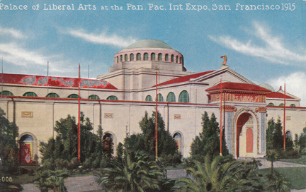
(typed message reads: “Westward Ho! Over the Rockies we go: on our way to the Golden Gate we will see deserts, prairies,cowboys, ranches, mountains, canyons, and the wonders of the west; the Orient, the Occident, the South Seas, the Arctic — all the world will be there. Meet us in the Palace of Liberal Arts, Court of the Universe, San Francisco.”)

But there’s one mystery that I’ve been working to solve, something that no one ever seems to discuss. It’s a question of the massive Underwood typewriter, which was shown with much fanfare at the PPIE.

04_palace of liberal arts_04

“Writing daily at the Underwood exhibit”, the Underwood Typewriter Company debuted an enormous 14 ton typewriter at the Expo’s Palace of Liberal Arts. At twenty one feet wide and 18 feet high, this particular Underwood was a feat of engineering. A grown adult could sit on one of its keys; photos from the Expo show attendees dwarfed by the gigantic contraption. Plans for the giant machine took a full year to develop; it was another year before the behemoth was constructed.

06_photo via_ foundsf

(typed message reads: “Bulletin by United Press: Liverpool, May 7th — the Cunard liner Lusitania with a heavy passenger list of Americans, was torpedoed and sunk off the Irish coast this afternoon. Small boats rushed from Queenstown to Old Head of Kinsale off which point the liner was torpedoed.”)

Daily news headlines were typed out on a nine-by-twelve-foot piece of paper; the typewriter itself required a 100-foot-long ribbon. “Printer’s Ink” magazine (Volume 91, April 1st, 1915) tells us that “it is run by power generated by three single one horse-power motors.” A regular sized Underwood in front of the larger showpiece was used in the typing of daily newsworthy headlines. A breaking news feature on May 7th, 1915, announced to fair-goers the sinking of the Lusitania by German submarines (as seen in the photo above.)

07_underwood

So here’s the mystery: a 14 ton typewriter with keys the size of car tires and taller than an adult elephant – where does something like that end up? I’ve long wondered. That’s the beauty of the internet: if you search diligently, you can usually piece together clues.

Giant Underwood Typewriter, Underwood Garden Pier Exhibit Atlantic City

After the PPIE wrapped up on December 4th, 1915, many of the Expo’s artifacts were sold at public auction. Parts of buildings were floated downriver to other bay area cities; artwork and furniture found their way into private collections. The Underwood Typewriter Company sold their 14 ton, award-winning typewriter to Atlantic City’s Boardwalk. Taken apart and loaded into two boxcars, the colossal machine traveled from one side of the country to the other.

08_atlantic city underwood

The excellent oz Typewriter blog has a first-rate write up of Jack Dempsey’s (that’s right – the boxer!) connection with the enormous typer, once it arrived in Atlantic City. As far as I can tell (via internet sleuthing), the Underwood resided in Atlantic City for twenty-or-so years. (Internet) Rumor has it that hired dancers pranced across the keys, typing out messages for onlookers.

10_NYworlds fair underwood_1939

In 1939, the World’s Fair opened in NYC. It seems that Underwood’s typer found a new home in the “Business Systems and Insurance Building” – a far cry from its glory days at the PPIE. Bill Cotter, in his book “The 1939-1940 World’s Fair” (Arcadia Press) states that “the exhibits inside were unlikely to attract many repeat visitors for they consisted of displays on banking, life insurance companies, calculators, safes, and other office equipment. The most popular displays were a 14 ton typewriter, the largest in the world, and IBM’s Gallery of Art and Science.”

11_1939_history by zim_01

(typed message reads: “Hey Folks: Welcome to the World’s Fair of 1940 in New York. –Henry D. Gibso… –> the young lady in photo has her foot at the ready, hovering above the letter “N”.)

At this point in my searching, the trail of the 14 ton typer goes cold. I’ve found vague references to World War II and implications that the Underwood Master Typewriter was sold to the US Army for scrap metal. Is this really truly what happened? Is there any way to ever possibly know?

12_PPIE typer

With all of our collective (internet) knowledge, I have no doubt that the “Whereabouts of the 14 Ton Typewriter” will one day be solved — beyond a question of a doubt. For now, I’ll keep hoping for the day that mankind manages to perfect time travel.  Then I’ll be able to find my way among the promenades and pathways of 1915’s PPIE, heading towards the Palace of Liberal Arts and a typewriter that dreams are made of.

–JH

Some great resources in relation to this write up:

KQED’s “Forum With Michael Krasney” – an interview with PPIE historians and author Laura Ackerly (Jewel City, published by Heyday Books)

Excellent photos of the Underwood exhibit at the 1939 World’s Fair (blog: History by Zim)

Learn interesting facts and unusual aspects related to typewriters! oz Typewriter (blog)

Read Full Post »

CWPE_05

There is a magical wonderland of a place that you may or may not have heard of, in the heart of New York City. Miz Happenstance and I were lucky enough to get in on the action when we visited NYC two weeks (or so) ago.

CWPE_01

CW Pencil Enterprise is a place which, I’m convinced, could only exist in NYC (or Tokyo.) Upon entering the lovely little store, one is immediately transported to a time when the smell of pencil shavings meant practicing one’s cursive writing and hand-crank pencil sharpeners were a staple in every classroom.

CWPE_02

Temptation is all around: beautifully arranged glasses filled with all manner pencils line the shelves…

CWPE_03

And a lovely cork board displays available models (why yes, they do have the famed Palamino Blackwing!)…

CWPE_04

There is also a wonderful selection of journals, erasers, and pencil sharpeners from companies far and wide. Japan, Switzerland, Germany, the UK, Argentina…pencils from across the globe are yours for the purchasing!

CWPE_06

The icing on the cake? CW Pencil Enterprise can customize pencils for you! Starting at two dollars per, there is a range of colors to choose from (see the above photo.) And guess what? No minimum order! So whether you want to order one for yourself or one hundred for the holiday season — CW can help you out. The extremely helpful staff is generous with their pencil knowledge, but beware: mechanical pencils have no place here!

Sharpen, sharpen, sharpen —

–JH

CW Pencil Enterprise feature in the New York Times

a fun interview with Caroline Weaver (CW Pencil Enterprise owner) via Pencil Revolution

how are pencils made? the History Channel shows us!

Read Full Post »

Older Posts »