
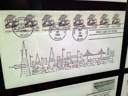
Calligrapher Alan Blackman has an unparalled passion for letters — both typographically and philatelically speaking.

Letters to Myself: The Calligraphic First Day Covers of Alan A. Blackman at the SF Public Library exhibits truly stunning work created by Blackman over the course of thirty six years.

Simply put: this is a beautiful exhibition: incredible calligraphy, wonderful philately, and ingenious design. I had the great good fortune of having the gallery (somewhat) all to myself when I stopped by to see the show; I felt that I was able to spend time one-on-one with each of Blackman’s creations, free of distractions.
Alongside the displayed artwork, a video interview (linked below) with Mr. Blackman describes his work at the Rincon Annex postal counter, a P.O. near and dear to my heart. He also references “two shops selling stamps for collectors near my place of employment” — I’m hoping that’s a reference to US Stamp and Supply Company, another place dear to my heart (which closed up shop in SF last year.)

“For colored writing I used gouache in tubes or water-soluble colored pencils. I later learned how to grind a set of colored Japanese stick inks on individual ink stones: one stone for reds, one for blues, one for greens, etc.”
–Alan Blackman, courtesy of the SFPL Book Arts and Special Collections “What’s Happening On the Sixth Floor” blog

There have been some delightful interviews and reviews of this exhibit over the past couple of months, most notably by the good folks over at Social Correspondence and the SF Chronicle. And while I feel that I could spend hours writing up how inspiring (and inspired) this show is, I find that putting the exhibition into words is much harder than I thought it would be, simply by virtue of the fact that it is so overwhelmingly thoughtful.

In interviews, Blackman is modest about his work; he says that he was initially surprised by people’s positive reactions to his decorated envelopes. Presenting them at a monthly meeting of San Francisco’s Friends of Calligraphy, he remarks: “I was so shy and sheepish, I thought something as personal as this would not appeal to anyone else. I brought what I had of my collection at the time, very sheepish, thinking that nobody could possibly be interested.”

“To my astonishment, everyone was fascinated beyond my wildest expectations. It seems like there might be a law here… something like the more personal your work, the more people admire it, but I don’t know if that’s universally true.”
–Alan Blackman, courtesy of the San Francisco Public Library’s YouTube channel

What more can I tell you? Do yourself a huge favor and stop by the Koret Gallery at the Main Branch of SFPL. Exhibition runs thru October 13th, 2015. More details can be found here.
–JH
add’l resources:
What’s On the Sixth Floor? (SFPL Book Arts and Special Collections blog)
video interview with Alan Blackman (many of the above quotes are pulled from this video)
Alan Blackman Calligraphy (Mr. Blackman’s website)


