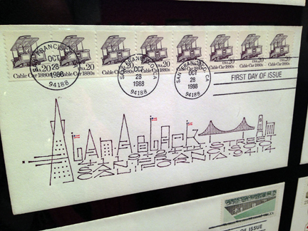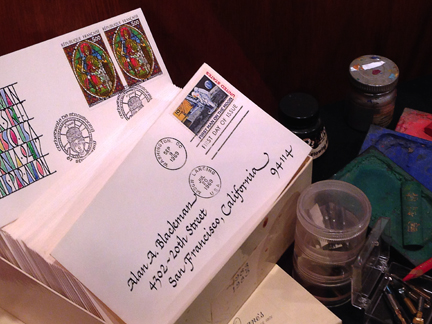
Nicholas Yeager is a man on a mission: to show the world-at-large that beautiful handwriting is not, in fact, a thing of the past. He’s a scribe practicing what he preaches, creating beautiful calligraphic works and historic bookbindings under the moniker of Biblioforge. Nick and I have known each other for well over a decade; every conversation with him is like an entire book conservation class in and of itself.

So when Nick described his current “Motoscribendi” project to me, I couldn’t help but be fascinated. 16th C. writing manuals? Visiting prestigious libraries across the US? And making the whole trip via motorcycle?
I MUST KNOW MORE.
Luckily for me, Nick was more than happy to answer a few questions for RLD readers! Continue reading below and discover fascinating details about calligraphic cursive, creating the perfect letterform, and the history of fancy flourishes — all hot topics for fans of contemporary lettering and calligraphy!

Jennie Hinchcliff: In general terms, can you describe for RLD readers what a writing manual is, and how it is different from other special collections books at the library?
Nick Yeager: A writing manual is an illustrated instruction manual describing how to make a specific writing style or “hand.” These books came into being early in the 16th century, with illustrations of stroke sequence being cut in wood to be printed in relief. In early writing manuals, the text was cut in wood, and no type was used. Later, the publishers would set instructions on ink making, quill-cutting and pen holding in type. By the end of the 16th century, texts and illustrations were being engraved in copper and printed intaglio rather than relief.

JH: What specific “tangibles” appeal to you about writing manuals? Why are they important (historically speaking)?
NY: I am drawn to the beauty of the graphic design. Writing manuals are a very complex mixture of book and advertising design in the earliest sense. Writing masters were trying to sell their skills and appeal to an audience through these beautiful writing samples, while educating people in as clear a fashion as possible.
The books themselves are quite interesting to handle and examine. First and foremost, I’m handling something that is usually somewhere in the neighborhood of 500 years old – and sometimes as “young” as one hundred years old. I’m touching the past, connecting with artisans who used and made these books. I guess that’s intangible, but it feels concrete to me. Secondly, the paper and ink and impression are fascinating, because I am a craftsman who makes letterforms and cuts them in wood, so I want to discover how those forms were made. I learn more by handling original prints than I ever could from a reproduction.

JH: What inspired the idea of touring around the US by motorcycle and stopping at different special collections libraries?
NY: I’ve been riding motorcycles since I was 13 and have always dreamed of riding across the country for an extended period of time. But just wandering around doesn’t appeal to me as there’s no structure to that. Just riding to a destination to “get there” doesn’t interest me either. I’ve been learning calligraphy, book design, and bookbinding history from writing manuals for decades. I’ve done this in libraries all over the country. Combining my love of motorcycle travel with my love of studying Renaissance (and later period) writing manuals into one effort makes sense to me. Anytime I can expand my knowledge, it’s an adventure, whether it’s on a motorcycle or in a library.

JH: Do writing manuals have quirks of printing or binding in the same way that medieval manuscripts (or other genres of bound codices) do? Is so, what are some of those quirks?
You’d be hard pressed to find two writing manuals that are the same in terms of binding, pagination and even paper! At the time of printing and publishing a first edition of any one of these titles, there were likely a number of similar copies even if they were bound differently. But these books tended to be used and used up, leaving very few copies of any given edition. Sometimes books were printed using blocks from other books, and sometimes an engraver made a fairly accurate copy of an existing image with some minor change that isn’t easily recognizable.

Also, as per your question: there’s absolutely no comparison to medieval manuscripts because they were always created one book at a time.
JH: Once you’ve returned home from your cross-country travels, what will be the next step with this project?
NY: Looking at writing manuals will be a grand time, but that’s only the beginning! The academic side of the trip is to learn different cataloging systems of various libraries in order to make a census of where these books are located. The Seymour De Ricci census is the model I hope to use for my writing manual census. Upon my return to the SF bay area, I’ll begin compiling catalog information and making it searchable online so that researchers/designers can find the location of certain writing manuals, which will aid future study in the field.

JH: last but not least – if RLD readers want to know more, where can they find you?
NY: Currently, I’m running an IndieGogo campaign to help pay for gas and travel expenses during my three month, cross country ride. I’ll be setting off on August 5th and from that point, readers can follow the Motoscribendi blog, where I’ll be keeping track of my thoughts and sharing stories from the road. And social media being what it is, you can find me in the following places:
Twitter – Nicholas Yeager
Instagram – Motoscribendi
Facebook – Motoscribendi.com
Well: it’s time to shake the dust off my shoes! I can hardly wait to see where Nick travels and what sorts of discoveries he makes. And who knows? Maybe somewhere, down a hidden aisle and amongst a stack of rare book gems, Nick will uncover a writing manual that has been unseen and untouched for generations – a book waiting especially for him, an exceptional treasure that all book readers (whether they know it or not) secretly long to discover.
–JH
Read Full Post »


