Feeds:
Posts
Comments

KWP_03

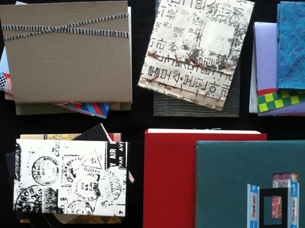
I can’t quite remember when Hope Amico of Gutwrench Press first found her way to my mailbox. However, I do remember that feeling of “holy cow! What is this beautiful printed thing here in my hand?!” The postcard was a little dinged up (that’s what happens when you send soft printmaking paper through the cruel machinery of the postal system) but the scritches and scratchings only added to the mystery of the card itself.

hope_book_01

Through a handful of addresses and cities, Hope and I have always managed to keep in touch postally. Her artists books and prints are a world unto themselves: beautifully printed, lovingly bound together, thoughtfully written. Her “Keep Writing Postcards” project is a natural extension of fine art works, a call-and-response with friends and strangers, using the medium of the post office.

datebooks2

Oakland-based gallery E.M. Wolfman is exhibiting “To Get A Letter, Send A Letter: Selections From the Keep Writing Postcards Project” through the month of August. Graciously, Hope took a bit of time to answer some questions for Red Letter Day readers about her process, what the “Keep Writing Postcards” project means to her, and the future of the project itself.

postcards_on_wall

Jennie Hinchcliff: In general terms, can you describe for RLD readers what the “Keep Writing Postcards” project is all about?

Hope Amico: It started as a way to keep in touch with friends as I moved away and began college. I started printing one postcard a month, using the handset type and presses at my university, mailing about 60 to friends on a mailing list. Within the first year I began collaborating with friends on the cards and began offering subscriptions to strangers. By the time I was finishing up school, it had evolved into the thing it is today: each month I letterpress print a folded card, consisting of two postcards. One postcard is something I’ve designed, illustrating a story or a quotation that I like. The other half has instructions for the recipient, usually somehow related to my design. Recipients fill out their half and mail it back to me. I post it online and sometimes share them in gallery shows.

prints_for_prince

JH: Describe an average month (from start to finish) for “Keep Writing Postcards” (i.e. what’s your working process like?)

HA: Ideally, on the first of the month, all the cards for that month are in the mail.  Usually they make it to the post box a few days later and sometimes get mailed as late as the middle of the month.  I spend a few days working out an idea, drawing, scanning, searching clip art, writing text and revising.

Then I spend about 2 days towards the end of the month making plates and printing.  I trim the cards, bring them to my home studio and spend a few hours listening to radio shows while scoring and folding, taping and stamping.  At some point I remember to print mailing labels from my subscriber list spreadsheet.  Sometimes this takes a minute; sometimes, on bad computer days, it can take hours, during which I reconsider the time-saving measure of printing labels. (ed note: HA! indeed…)

The last step is best.  I write at least “hello” and sign my name on all the cards, writing longer notes every few cards.  Sometimes I bring a stack with me if I am going out to eat alone.  Then I drop them in the mail box and start again.

all the tools

JH:How do you decide on each month’s theme?

HA: I have a list in my journal of potential ideas. Some months there is an event or holiday I would like to highlight or work with but sometimes I have a technique I want to work with.   I try to mix it up so that some months ask for a story, followed maybe by a fill-in-the blank image or sentence and then maybe a drawing-friendly idea.  That’s the ideal.

But sometimes I plan a few months ahead only to think of something more appealing to me at the last minute.  I like the month to month variety but sometimes I print everything in silver for two months in a row.   I want to plan two months ahead but I also like having a thoughtful but open enough prompt that many people want to respond. There is a balance between offering enough guidelines and specifics to inspire and be clear while leaving room for all the creative answers.

And some months I just want a break or want to give everyone a break or have an idea for a card without a response so I print that. Everyone needs a break from obligations to keep them fun, right?

gallery_01

JH: Each of the postcards that you send out are beautifully letterpressed and oftentimes incorporate an image you’ve collaborated on with another artist. Can you talk a little bit about the nature of collaboration, both in the postcards you’ve created and the works you’re receiving from participants?

HA: When I started the project, the first year was just a single postcards that I printed.  Then I thought I’d try a year of collaborating with a different artist friend each month.  A few of my friends are printers and they sent me 150 cards partially printed  leaving the rest for me.  Those were fun but took a lot of coordination.  If someone was late, then I was behind schedule. And some of my friends are not printers at all and had wild ideas about what to make.  Collaborating every month was fun but not practical.

bicycle postcard

I wanted a way to hear back from people, so that it wasn’t just my story being told but my part of a story, my point of view.  So I began these cards with a tear-off response card, allowing people to choose to participate but the project continues even if some people never send cards back.  But sometimes, when they do, it adds something unexpected.   One month, I drew a map of my neighborhood in New Orleans, as I remembered it, and asked recipients to send me back a map of anything. One of my favorite responses was from my best friend and former neighbor who drew the same neighborhood from their perspective.  It was lovely.

Having a card with my address already printed and a question to be answered meant I would hear back from people, sometimes people I would not expect to write back.  My best penpals do not necessarily send the most postcards, but my little (now 30 year old and married) cousin had an amazing streak of responding to every single card.  It often surprises me who I hear from the most often.

all the tools

JH: Did you find that it was an easy transition to think about the work you were receiving at your mailbox in relation to a gallery show? Did “Keep Writing Postcards” start out with the intention of an eventual exhibition?

HA: This started out as a personal project but I was spending so much time on it while in school for my printmaking degree,  I realized that it was worth getting credit at school.  But I was so protective of it I didn’t share it much until its 3rd year, entering my final year at school. By that point, I knew I wanted it to be part of my senior show, that I wanted to spend all my time making postcards.  This is when I started printing the cards in the form they are now, an interactive piece with responses to share.  So, from that point I knew they would be shared.

When I graduated and moved to Oakland, I knew I wanted to have another show and share the work again.  I also work in other forms, but this project is definitely what is most dear to me — it is the one that is easiest for me to be excited about and to share and explain. I like creating environments in which people want to sit and read the cards, where it is clear that you can handle the art work and participate.  I like that intersection of function and involvement in a gallery space. I want it to feel like home, so I have included a lamp, a desk, a writing utensil and even a tape player with headphones to listen to music written especially for the show (another kind of collaboration!)

KWP_01

JH: I’m super excited to see the show at E.M. Wolfman! What sorts of additional activities will there be, in relation to the show itself? How long will the show be running?

HA: The show is up through the end of August. There is a box with this month’s postcard so gallery-goers can participate. I am taking the responses from this card (about neighborhoods) and making a map for people to give themselves a self-guided tour at the end of the show.  I want to do this every few months: have a mail box stationed at a certain place, asking for input from whoever comes by.
Also, every Saturday in July from 1-3 pm I will be there writing letters. You can join me. There are postcards and stationery for sale and I think I’ll bring a few other fun surprises to share. On July 22nd, I’ll be giving a brief talk about the project too during the Post A Letter Social Activity Club event at E.M. Wolfmann.

for more information:

“Postcard Artist Trusts the Message Will Be Delivered”, SF Gate, July 1st, 2015 (Evan Karp, author)

— Hope will be vending her lovely wares (including subscriptions to the “Keep Writing Postcards Project” at this year’s SF Zine Fest, September 6th at the SF County Fair Building in Golden Gate Park.

I know, I know: two posts in one week. But I just couldn’t save this one until next week (especially since I’ve got a FANTASTIC interview with Hope Amico all lined up!) So I figured I’d share this as a “welcome to your weekend” sort of thing.

I was interviewed at the ALA2015 Conference by Joseph Coco, on behalf of Rebecca Hillburn and her “Natto Soup” blog. Joseph and I chat about mail art, zines, and how to get involved in the Network — take a look! (everything was completely UNSCRIPTED –> insert some sort of anxiety emoji here…)

PS: there is a little flub that I made at the very beginning of the interview…did any of you catch it? If you hit the 2 minute mark, you’ve gone too far!

–JH


01_borch

Nicholas Yeager is a man on a mission: to show the world-at-large that beautiful handwriting is not, in fact, a thing of the past. He’s a scribe practicing what he preaches, creating beautiful calligraphic works and historic bookbindings under the moniker of Biblioforge. Nick and I have known each other for well over a decade; every conversation with him is like an entire book conservation class in and of itself.

02_scribes at work

So when Nick described his current “Motoscribendi” project to me, I couldn’t help but be fascinated. 16th C. writing manuals? Visiting prestigious libraries across the US? And making the whole trip via motorcycle?

I MUST KNOW MORE.

Luckily for me, Nick was more than happy to answer a few questions for RLD readers! Continue reading below and discover fascinating details about calligraphic cursive, creating the perfect letterform, and the history of fancy flourishes — all hot topics for fans of contemporary lettering and calligraphy!

03_letter m_USE

Jennie Hinchcliff: In general terms, can you describe for RLD readers what a writing manual is, and how it is different from other special collections books at the library?

Nick Yeager: A writing manual is an illustrated instruction manual describing how to make a specific writing style or “hand.” These books came into being early in the 16th century, with illustrations of stroke sequence being cut in wood to be printed in relief. In early writing manuals, the text was cut in wood, and no type was used. Later, the publishers would set instructions on ink making, quill-cutting and pen holding in type. By the end of the 16th century, texts and illustrations were being engraved in copper and printed intaglio rather than relief.

05_writing manual

JH: What specific “tangibles” appeal to you about writing manuals? Why are they important (historically speaking)?

NY: I am drawn to the beauty of the graphic design. Writing manuals are a very complex mixture of book and advertising design in the earliest sense. Writing masters were trying to sell their skills and appeal to an audience through these beautiful writing samples, while educating people in as clear a fashion as possible.

The books themselves are quite interesting to handle and examine. First and foremost, I’m handling something that is usually somewhere in the neighborhood of 500 years old – and sometimes as “young” as one hundred years old. I’m touching the past, connecting with artisans who used and made these books. I guess that’s intangible, but it feels concrete to me. Secondly, the paper and ink and impression are fascinating, because I am a craftsman who makes letterforms and cuts them in wood, so I want to discover how those forms were made. I learn more by handling original prints than I ever could from a reproduction.

04_hand with quill_USE

JH: What inspired the idea of touring around the US by motorcycle and stopping at different special collections libraries?

NY: I’ve been riding motorcycles since I was 13 and have always dreamed of riding across the country for an extended period of time. But just wandering around doesn’t appeal to me as there’s no structure to that. Just riding to a destination to “get there” doesn’t interest me either. I’ve been learning calligraphy, book design, and bookbinding history from writing manuals for decades. I’ve done this in libraries all over the country. Combining my love of motorcycle travel with my love of studying Renaissance (and later period) writing manuals into one effort makes sense to me. Anytime I can expand my knowledge, it’s an adventure, whether it’s on a motorcycle or in a library.

06_single page

JH: Do writing manuals have quirks of printing or binding in the same way that medieval manuscripts (or other genres of bound codices) do? Is so, what are some of those quirks?

You’d be hard pressed to find two writing manuals that are the same in terms of binding, pagination and even paper! At the time of printing and publishing a first edition of any one of these titles, there were likely a number of similar copies even if they were bound differently. But these books tended to be used and used up, leaving very few copies of any given edition. Sometimes books were printed using blocks from other books, and sometimes an engraver made a fairly accurate copy of an existing image with some minor change that isn’t easily recognizable.

07_writing manual

Also, as per your question: there’s absolutely no comparison to medieval manuscripts because they were always created one book at a time.

JH: Once you’ve returned home from your cross-country travels, what will be the next step with this project? 

NY: Looking at writing manuals will be a grand time, but that’s only the beginning! The academic side of the trip is to learn different cataloging systems of various libraries in order to make a census of where these books are located. The Seymour De Ricci census is the model I hope to use for my writing manual census. Upon my return to the SF bay area, I’ll begin compiling catalog information and making it searchable online so that researchers/designers can find the location of certain writing manuals, which will aid future study in the field.

08_letters

JH: last but not least – if RLD readers want to know more, where can they find you?

NY: Currently, I’m running an IndieGogo campaign to help pay for gas and travel expenses during my three month, cross country ride. I’ll be setting off on August 5th and from that point, readers can follow the Motoscribendi blog, where I’ll be keeping track of my thoughts and sharing stories from the road. And social media being what it is, you can find me in the following places:

Twitter – Nicholas Yeager

Instagram – Motoscribendi

Facebook – Motoscribendi.com

Well: it’s time to shake the dust off my shoes! I can hardly wait to see where Nick travels and what sorts of discoveries he makes. And who knows? Maybe somewhere, down a hidden aisle and amongst a stack of rare book gems, Nick will uncover a writing manual that has been unseen and untouched for generations – a book waiting especially for him, an exceptional treasure that all book readers (whether they know it or not) secretly long to discover.

–JH

IMG_4631

This past weekend I felt oh-so-lucky: I was an invited artist for the American Library Association’s Zine Pavilion! Imagine if you will: a national conference of librarians descending upon San Francisco, who are brimming with curiosity about zines and zine making!

IMG_4623

I spent most of last week getting a bunch of new (and old) things ready: issues 1-4 of RLD, rubber stamps, zines that were due to be reprinted…

IMG_4622

…and Miz Happenstance put together a handful of “Herstorical Oakland” artistamps (shown above), in order to showcase them at the table.

IMG_4633

Much of the weekend was spent discussing zines: what sorts of people make them, how they can be defined, the different ways in which libraries collect them. In the photo above, you can see some zines on display; ALA attendees could read anything they wanted, with the entire collection raffled off to one lucky winner on the final day of the conference.

IMG_4624

Interested parties could contribute a page at the make-a-zine table…

IMG_4625

…using materials and supplies provided by Zine Pavilion organizers.

IMG_4628

IMG_4626

The idea being that: on the final day of the conference, if you had contributed a page to the group project, you could return to the Pavilion on the final conference day and collect a copy of your zine! (I really really really love this idea, and would like to figure out a way to implement it into my own zine making projects.)

IMG_4638

Some of you may remember punk rock poet/zinester/mail artist Irene Dogmatic from last year’s Ex Postal Facto event; she was my tablemate for part of the event, which I greatly enjoyed. XPF was so frenetic, I didn’t have a real chance to connect with Irene in just the right way. Sharing the weekend with her was enlightening, entertaining, and wonderful.

IMG_4640

I learned a new party game called “Knuckle Sharpie” from Alex Wrekk (one of my zinester heroines) and Jonas Cannon (buy his zine Cheer The Eff Up RIGHT NOW): cross your arms at the wrists and have a person on the left and right hand side of you (different folks, naturally!) write four letter words across your knuckles. No peeking! When everyone has written something silly/serious, put your right and left hands together: that’s the name of your new punk rock/goth/emo band! Hilarity will ensue.

IMG_4644

(I even managed to get some “work” in, during the down time of the event…SF Correspondence Co-op lists shown above, hand stamped with all the usual goodies!)

IMG_4647

Weekend’s end: I packed up my remaining zines and headed back out to the fogbelt. As I was making my way to the studio, I spied this work of art hanging from a telephone pole — I felt this was a good omen for the week to come, as well as a lovely way to end the fantastic weekend which had just passed.

May each of you have a creative and inspired week, as well as a happy fourth of July! Light some fireworks for me (my Aries personality LOVES fireworks!)

–JH

01_UnderwoodTags_via snfranciscomemories.com

As many of you know, June 23rd is World Typewriter Day. This is a day in which we celebrate those weighty machines which give us great joy by clicking, clacking, and “ding!”ing. It’s a day to swap out old typewriter ribbons for new ones and oil our carriage levers!

02_postal cancel_PPIE_02

(above message reads: “What do you think of this machine? It is in operation every day. –Al)

Let’s take a step back and look at a larger picture: this year is also the 100 year anniversary of San Francisco’s Pan Pacific International Expo (PPIE, for short.) In 1915, the Expo was a wonderment to behold — San Francisco’s first big “event” after the devastation of 1906’s earthquake and fire. Countries from around the globe (as well as states across the US) sent emissaries, exhibits, and artwork of their best and brightest. Practically speaking, the PPIE commemorated the opening of the Panama Canal and celebrated SF’s phoenix-like rebuilding of the city.

03_1915-worlds-fair

I have always been fascinated with the PPIE; in the San Francisco of today, you can still find remnants of the Expo – if you look carefully. The Palace of Fine Arts still stands, but there are also many hidden bits (artwork and architecture) tucked away around the bay area.

05_women on typer_

(typed message reads: “Westward Ho! Over the Rockies we go: on our way to the Golden Gate we will see deserts, prairies,cowboys, ranches, mountains, canyons, and the wonders of the west; the Orient, the Occident, the South Seas, the Arctic — all the world will be there. Meet us in the Palace of Liberal Arts, Court of the Universe, San Francisco.”)

But there’s one mystery that I’ve been working to solve, something that no one ever seems to discuss. It’s a question of the massive Underwood typewriter, which was shown with much fanfare at the PPIE.

04_palace of liberal arts_04

“Writing daily at the Underwood exhibit”, the Underwood Typewriter Company debuted an enormous 14 ton typewriter at the Expo’s Palace of Liberal Arts. At twenty one feet wide and 18 feet high, this particular Underwood was a feat of engineering. A grown adult could sit on one of its keys; photos from the Expo show attendees dwarfed by the gigantic contraption. Plans for the giant machine took a full year to develop; it was another year before the behemoth was constructed.

06_photo via_ foundsf

(typed message reads: “Bulletin by United Press: Liverpool, May 7th — the Cunard liner Lusitania with a heavy passenger list of Americans, was torpedoed and sunk off the Irish coast this afternoon. Small boats rushed from Queenstown to Old Head of Kinsale off which point the liner was torpedoed.”)

Daily news headlines were typed out on a nine-by-twelve-foot piece of paper; the typewriter itself required a 100-foot-long ribbon. “Printer’s Ink” magazine (Volume 91, April 1st, 1915) tells us that “it is run by power generated by three single one horse-power motors.” A regular sized Underwood in front of the larger showpiece was used in the typing of daily newsworthy headlines. A breaking news feature on May 7th, 1915, announced to fair-goers the sinking of the Lusitania by German submarines (as seen in the photo above.)

07_underwood

So here’s the mystery: a 14 ton typewriter with keys the size of car tires and taller than an adult elephant – where does something like that end up? I’ve long wondered. That’s the beauty of the internet: if you search diligently, you can usually piece together clues.

Giant Underwood Typewriter, Underwood Garden Pier Exhibit Atlantic City

After the PPIE wrapped up on December 4th, 1915, many of the Expo’s artifacts were sold at public auction. Parts of buildings were floated downriver to other bay area cities; artwork and furniture found their way into private collections. The Underwood Typewriter Company sold their 14 ton, award-winning typewriter to Atlantic City’s Boardwalk. Taken apart and loaded into two boxcars, the colossal machine traveled from one side of the country to the other.

08_atlantic city underwood

The excellent oz Typewriter blog has a first-rate write up of Jack Dempsey’s (that’s right – the boxer!) connection with the enormous typer, once it arrived in Atlantic City. As far as I can tell (via internet sleuthing), the Underwood resided in Atlantic City for twenty-or-so years. (Internet) Rumor has it that hired dancers pranced across the keys, typing out messages for onlookers.

10_NYworlds fair underwood_1939

In 1939, the World’s Fair opened in NYC. It seems that Underwood’s typer found a new home in the “Business Systems and Insurance Building” – a far cry from its glory days at the PPIE. Bill Cotter, in his book “The 1939-1940 World’s Fair” (Arcadia Press) states that “the exhibits inside were unlikely to attract many repeat visitors for they consisted of displays on banking, life insurance companies, calculators, safes, and other office equipment. The most popular displays were a 14 ton typewriter, the largest in the world, and IBM’s Gallery of Art and Science.”

11_1939_history by zim_01

(typed message reads: “Hey Folks: Welcome to the World’s Fair of 1940 in New York. –Henry D. Gibso… –> the young lady in photo has her foot at the ready, hovering above the letter “N”.)

At this point in my searching, the trail of the 14 ton typer goes cold. I’ve found vague references to World War II and implications that the Underwood Master Typewriter was sold to the US Army for scrap metal. Is this really truly what happened? Is there any way to ever possibly know?

12_PPIE typer

With all of our collective (internet) knowledge, I have no doubt that the “Whereabouts of the 14 Ton Typewriter” will one day be solved — beyond a question of a doubt. For now, I’ll keep hoping for the day that mankind manages to perfect time travel.  Then I’ll be able to find my way among the promenades and pathways of 1915’s PPIE, heading towards the Palace of Liberal Arts and a typewriter that dreams are made of.

–JH

Some great resources in relation to this write up:

KQED’s “Forum With Michael Krasney” – an interview with PPIE historians and author Laura Ackerly (Jewel City, published by Heyday Books)

Excellent photos of the Underwood exhibit at the 1939 World’s Fair (blog: History by Zim)

Learn interesting facts and unusual aspects related to typewriters! oz Typewriter (blog)

hinchcliff_intro_01

(above: samples from the “Introduction to Bookbinding” class taught by Red Letter Day)

It always seems weird to me, every single time: in the middle of summer (or fall or winter) I’m sitting down with my datebook to plan up a storm of teaching. Any workshop instructor knows that most classes are scheduled well in advance; that means I’m already well into the planning stages for holiday 2015 classes while most folks are packing the RV and heading off to Lake Tahoe.

hinchcliff_non ad acc_02

(above: Non Adhesive Accordion Books, 09.23, SFCB)

hinchcliff_flim flam_02

(above: The Book of Flim Flam, 08.24, SFCB)

This year is no exception! If you’re here in the San Francisco bay area, I’d love to see you in one of my classes at the San Francisco Center for the Book.

hinchcliff_yesmen_01

(above: Creative Carousel Books, 10.11, SFCB)

I’ll be teaching plenty of favorites: “Faux Postage”, “Creative Carousel Books”, and “Non-Adhesive Accordion Books”…

hinchcliff_faux post_01

(above: Fabulous Faux Postage, 11.18, SFCB)

…as well as a new class or two! (“The Book of Flim Flam” and “Single Signature Hardcover Binding”)

group_shot_01 (2)

(above: student work from the Creative Carousel Books class)

Needless to say, there’s something for everyone, regardless of skill set! Just think: if you start planning now, you can give a handmade gift from the heart during the holiday season. Perhaps you’d like to design artistamps for your outgoing kringle mail; maybe Auntie Grace or a nephew would like a created-just-for-them journal. Whatever the case, I’ll be teaching a class that shows you how-to!

hinchcliff_hi res_intro to bkbndg_02

(above: “Introduction to Bookbinding” samples)

Dream it and DO it! (and I’ll see you in class!)

–JH

For more info, visit SF Center for the Book –> Workshops, and search by either “month” or “type”; my workshops fall under both “binding” and “arts”.


CWPE_05

There is a magical wonderland of a place that you may or may not have heard of, in the heart of New York City. Miz Happenstance and I were lucky enough to get in on the action when we visited NYC two weeks (or so) ago.

CWPE_01

CW Pencil Enterprise is a place which, I’m convinced, could only exist in NYC (or Tokyo.) Upon entering the lovely little store, one is immediately transported to a time when the smell of pencil shavings meant practicing one’s cursive writing and hand-crank pencil sharpeners were a staple in every classroom.

CWPE_02

Temptation is all around: beautifully arranged glasses filled with all manner pencils line the shelves…

CWPE_03

And a lovely cork board displays available models (why yes, they do have the famed Palamino Blackwing!)…

CWPE_04

There is also a wonderful selection of journals, erasers, and pencil sharpeners from companies far and wide. Japan, Switzerland, Germany, the UK, Argentina…pencils from across the globe are yours for the purchasing!

CWPE_06

The icing on the cake? CW Pencil Enterprise can customize pencils for you! Starting at two dollars per, there is a range of colors to choose from (see the above photo.) And guess what? No minimum order! So whether you want to order one for yourself or one hundred for the holiday season — CW can help you out. The extremely helpful staff is generous with their pencil knowledge, but beware: mechanical pencils have no place here!

Sharpen, sharpen, sharpen —

–JH

CW Pencil Enterprise feature in the New York Times

a fun interview with Caroline Weaver (CW Pencil Enterprise owner) via Pencil Revolution

how are pencils made? the History Channel shows us!

RLD photo_02

As you can see, it’s been a whirlwind of productivity at the RLD studio! Don’t let the mess frighten you; it looks far more daunting than it actually is. Underneath the above pictured “mountain of mess” is a pile of items-to-be-mailed-out, projects-which-have-been-completed, and things-in-progress. All in all: a great and fantastical situation to be in!

RLD photo_01

I’m happy to announce that I am in the process of booking up my fall teaching schedule; more on that with next week’s blog post! I have a handful of new classes that I’ll be teaching at SFCB, alongside ever popular book/mail art favorites. Photos and descriptions will be forthcoming (you’re welcome to follow my Instagram and twitter feeds [@redletterzine] to keep track of all the booky/stamp-ish details!)

Love and Postage —

–JH

feet with heart

Sure, sure: today’s Friday the 13th. But have you seen this morning’s blog post over at uspsstamps.com?! Featuring the work of mail artists Sally Wurlitzer, Stan Askew, Niko Courtelis/Philatelic Atrocities (and yours truly), there’s a slew of delicious eye-candy, postally speaking.

Header-Collage

photo via uspsstamps.com

Each artist was invited to create work inspired by 2015’s new USPS Forever Love stamps, the post office, and Valentine’s Day. In addition, we were asked to discuss our working process and reasons why we “love the Love” so much.

love_USPS

Thank you so much to the USPS Stamps blog for inviting me to participate in this article as well as highlighting contemporary correspondence artists! While USPS employees “move the mail” every day, designers behind the scenes give correspondence artists additional tools (i.e. beautiful postage) to work with. A beautifully designed postage stamp is icing on the (cup)cake, so to speak: a thoughtful detail which completes a single work of (mail) art.

–JH

PS: interested in reading about why I make the things I make, and mail the things I mail? uspsstamps.com interviewed me last year about what it means to be a contemporary postal modern. Take a look here.

IMG_2065

February: already?!?! I can’t believe it. And yet, I look at my calendar and the proof is right there in black and white: today is February 4th.

This month heralds many things to the postally-minded: construction paper hearts  of bright pink, the debut of the USPS’s annual Chinese new year postage, a smattering of red glitter and glue stick. The days are (slowly) growing longer, which means a few additional minutes to dash over to the P.O.

IMG_2078

The end-of-year holiday bustle is over (whew!), so that also means there’s a bit more “breathing room” when it comes to doing things just-for-fun. To that end, I discovered something I’m excited to share with you, RLD mail art creators!

IMG_2625

First: some background info. Located in Berkeley, CA, Castle In The Air is a heaven on earth for folks who can’t get enough of the following things: the smell of fountain pen ink, the feel of finely milled paper, and the sound of hand bound journal pages softly whispering through the air. A world unto itself, “The Castle” is a nook you never want to leave — a fairyland of shelves and drawers filled to the brim with pens, nibs, books, and things of beauty. (personal plug: they also carry Red Handed Rubber Stamps!)

castle-in-the-air

store photo via businessinsider.com

Castle In The Air loves correspondence and all things related to mail art, letter writing, penmanship, and beautiful missives. They believe in old school correspondence so much, they have a gem called the “Blue Castle Badge”, which I KNOW you are going to want.

But you have to earn it!

IMG_2627

How do you earn a BCBadge of your very own? Start off by heading over to the website, and perusing the guidelines for mailing

Some additional advice for readers of the RLD blog:

  • –address your letters/postcards to “Blue Castle Badge/Castle In The Air”, etc. etc. ; this will help the Castle sprites sort your missive into the correct place and stack.
  • –interested in creating a themed postcard or envelope? Show/tell Castle In The Air why you love letter writing, correspondence, mail art, fountain pens, calligraphy — anything related to the paper or book-ish arts!
  • –if you’d like, feel free to mention that you read about the Blue Castle Badge right here at the RLD blog.

In return, you’ll receive a lovely enamel pin to wear proudly on your label. Or, perhaps – if you’re like me – it will adorn your pencil case!

IMG_2623

Happy creating! Go forth and share your love of correspondence and let me know what you send off to The Castle!

–JH